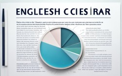
Pie charts are a powerful tool for presenting data visually, especially in English writing tasks. Whether you're preparing for academic exams, business reports, or IELTS essays, understanding how to describe pie charts effectively can elevate your writing. This guide explores practical techniques, supported by the latest data, to help you craft compelling pie chart descriptions.

Why Pie Charts Matter in English Writing
Pie charts simplify complex data by dividing it into proportional segments. In English writing, they often appear in:
- Academic essays (e.g., IELTS Task 1)
- Business presentations
- Research papers
- Data journalism
A well-written pie chart description should:
- Introduce the chart’s purpose – State what the data represents.
- Highlight key trends – Identify largest/smallest segments or notable comparisons.
- Use precise language – Employ terms like "accounts for," "comprises," or "represents."
Latest Data Examples for Pie Chart Descriptions
To demonstrate, let’s analyze real-world data. Below is a 2024 breakdown of global internet usage by device type, sourced from Statista (2024):
| Device Type | Market Share (%) |
|---|---|
| Smartphones | 3 |
| Laptops/Desktops | 1 |
| Tablets | 8 |
| Others | 8 |
Sample Description:
"The pie chart illustrates the distribution of global internet usage by device type in 2024. Smartphones dominate the market, accounting for 58.3% of total usage, followed by laptops and desktops (32.1%). Tablets and other devices represent significantly smaller shares at 6.8% and 2.8%, respectively."
Key Techniques for Describing Pie Charts
Start with a Clear Overview
Begin by summarizing the chart’s main message. Avoid listing every detail; instead, focus on the big picture.

Example:
"The chart highlights the primary energy sources in the European Union as of 2023, with renewables surpassing fossil fuels for the first time."
Use Comparative Language
Compare segments using phrases like:
- "Twice as many as..."
- "A marginal difference between..."
- "Significantly higher/lower than..."
Data Example (Eurostat, 2023):
| Energy Source | Share (%) |
|----------------|-----------|
| Renewables | 41 |
| Fossil Fuels | 37 |
| Nuclear | 22 |
Application:
"Renewables contribute 41% of the EU’s energy mix, narrowly exceeding fossil fuels (37%), while nuclear power makes up the remaining 22%."
Incorporate Percentages and Proportions
Precision is critical. Instead of vague terms like "a large part," specify percentages.

Example:
- Weak: "Most people use smartphones."
- Strong: "Nearly 60% of internet users access the web via smartphones."
Group Similar Data
If a chart has many small segments, combine them for clarity.
Data Example (UNESCO, 2023):
| Education Level | Global Enrollment (%) |
|-----------------------|-----------------------|
| Primary | 72 |
| Secondary | 45 |
| Tertiary | 38 |
| No Formal Education | 5 |
Application:
"While 72% of children enroll in primary education, participation drops sharply at higher levels, with only 38% attending tertiary institutions. A small minority (5%) receive no formal schooling."
Common Mistakes to Avoid
- Overloading with Data – Focus on trends, not every percentage.
- Ignoring Units – Always specify whether data is in percentages, millions, etc.
- Misinterpreting Proportions – Double-check calculations before making claims.
Enhancing Your Practice
To improve, analyze pie charts from reputable sources like:

- Pew Research Center (social trends)
- World Bank (economic data)
- IELTS Official Practice Materials (exam-specific examples)
Try rewriting descriptions using the techniques above. For instance, take this 2024 Forbes data on remote work preferences:
| Preference | Percentage (%) |
|---|---|
| Fully Remote | 32 |
| Hybrid | 48 |
| Office-Only | 20 |
Your Turn:
"The chart reveals a strong preference for hybrid work models in 2024, chosen by 48% of employees. Fully remote and office-only arrangements are less popular, at 32% and 20% respectively."
Final Thoughts
Mastering pie chart descriptions requires practice and precision. By leveraging up-to-date data and clear language, you can turn raw numbers into compelling narratives. Whether for exams or professional reports, these skills will make your English writing more authoritative and engaging.
Remember: Great data interpretation starts with understanding the story behind the slices. Keep practicing with real-world examples, and soon, describing pie charts will feel as natural as writing any other paragraph.